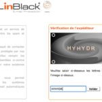
Too dissuasive anti spam (and anti conversion) process
Spams can be a hassle, and I agree sometimes you have to find a way to get rid of them. With current email systems and a [...]

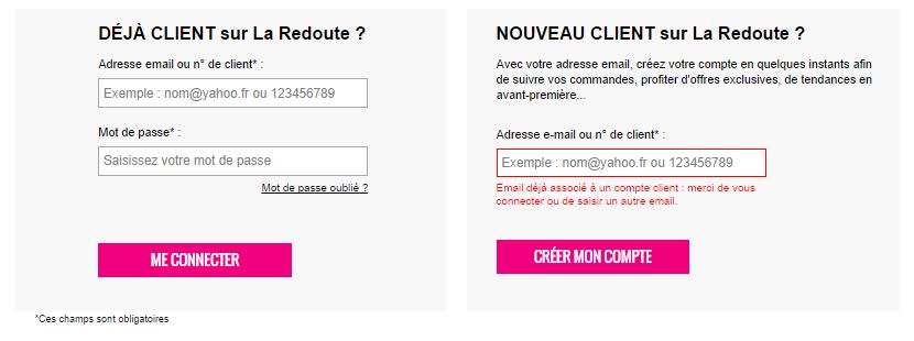
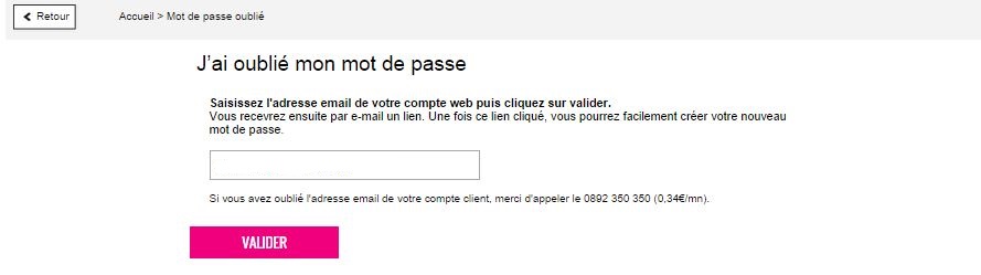
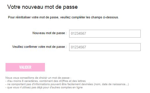
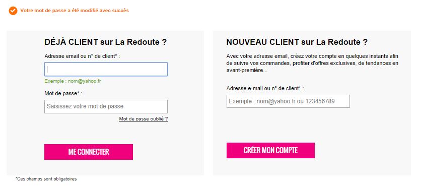
Oups, forgot my password again. This is no surprise: we have more and more accounts on more and more websites. Some accounts we have created a while ago, and all of sudden the website remembers us we do have an existing account with them. Right. But what was my password again? All websites offer a standard Forgotten password link, but what happens next vary, with some websites offering a much better service than others. This morning I found a very nicely done Forgotten-password process and interface while browsing laredoute.com.

Here is why I like this example, and what I find cool about it:
Spams can be a hassle, and I agree sometimes you have to find a way to get rid of them. With current email systems and a [...]
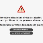
When it comes to e-commerce, best practices are well-known and studied, and most websites now apply them. But, more [...]
Let’s not let newsletters aside, and go on talking about it, as there are son many things to say! Studying email [...]