Check actual screen resolution live – web-based
I usually rely on W3C Schools screen resolution statistics. Though, here and then we do need to have a precise [...]

Mobile and tablets made appear a lot of new resolutions. Though, we still need to improve interfaces for « normal » desktop and laptop computers. In order to design for an optimal resolution, I rely on W3C Schools screen resolutions statistics. And in order to always keep in mind how many people I am potentially degrading the experience for if I design bigger, I sticked the following table close to my sight.
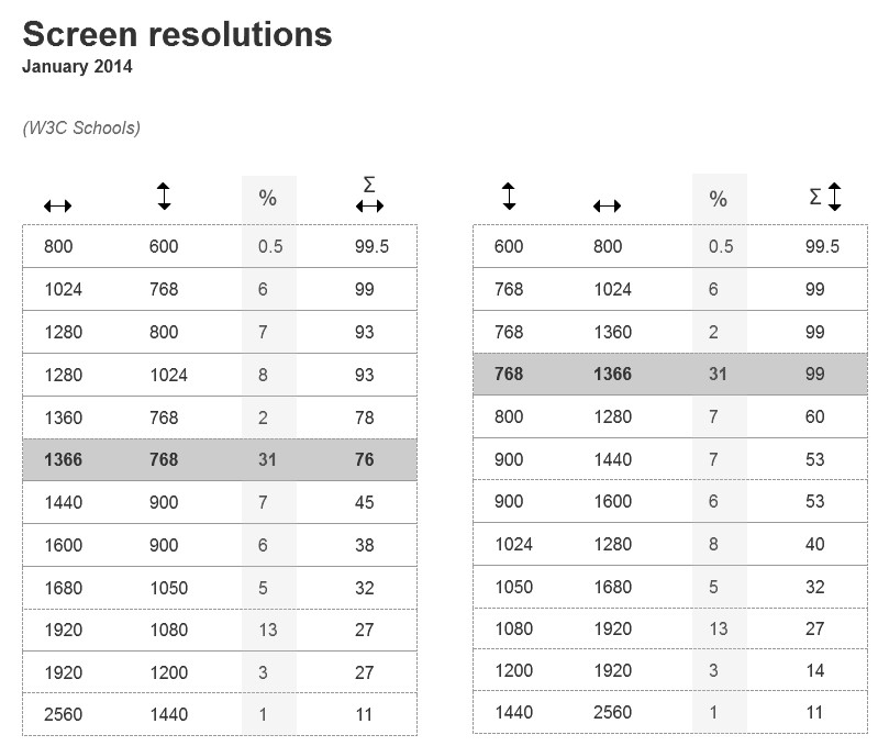
Both tables show a list of screen resolutions. Left table displays ascending widths, and right table ascending heights. The % column states the percentage of users with that resolution, according to W3C Schools. The last column displays the percentage of population I offer an optimal design for.
In 2014, 1366 x 768 pixels is the most popular screen resolution, with 31% users. Though, designing for 1024 x 768 still allows to offer an optimal experience for 99% users. Increasing width to 1280 pixels make us exclude 7% users; increasing height to 800 pixels make us exclude 40% of the population.
No matter the temptations, I will keep design for a base of 1024 x 768 pixels for a while (starting with mobile and tablets resolutions of course.)
I usually rely on W3C Schools screen resolution statistics. Though, here and then we do need to have a precise [...]
Adviso has just conducted some research about ideal email width, and here are the main points of the article published [...]
With Internet users surfing more and more from their smartphone, the question of screen resolutions has become a major [...]