Footer optimization
Big or small footer? I recently came to this question regarding an oline news website: is it stil a good thing to offer [...]
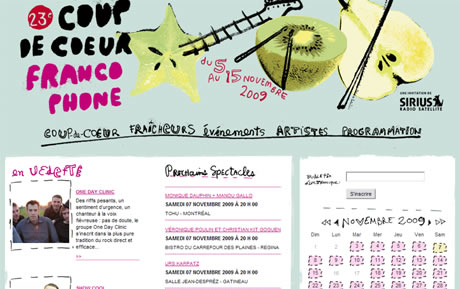
Coup de Coeur Francophone is a music festival which takes place everywhere in Canada. As you could guess, all the concerts are French-speaking, and the festival is impulsed by local French-speaking communities all around the country. Coup de Coeur was created in 1987, and it has expanded its influence ever since, featuring and discovering unique talents. Its current website, coupdecoeur.qc.ca, has been created in 2008, for the event’s 22nd issue. The design was created by orangetango, a very creative communication agency in Montreal, who had also designed the festival’s ad campaigns for a few years. After one whole year of operation, It thought it could be interesting to browse the website for optimization recommendations. I suggest we do this with a SWOT (Strength, Weaknesses, Opportunities, Threats), and see what happens (it’s the first workshop I do on this blog, and it may not be the last…)

Design: strong personality. The global aspect of coupdecoeur.qc.ca can seem a little strange, as it is all with shiny colours and hand-writing, but I do think it corresponds a lot to the festival’s spirit, like a family event, very human. I have already seen this year’s ad campaigns in the street, and it’s fun to see the ad’s design reflected on the website.
Search options and interactive calendar. On every page, visitors can browse the interactive calendar to find an event, as well as look for a specific event with the quick search form. As it is displayed on the home page too, visitors who know what they’re looking for, whether they know the date and the place or they know the artist, can very quickly navigate to the contents they’re interested in.
Featured artists on the home page. The featured-artists zone on the home page is even more relevant knowing that most artists are not well-known by everyone. So on the home page we have both search options, for visitors who know what they’re looking for, and featured artists for people who wish to discover, without a precise idea of what they’re interested in.
Artists list: incitative. The Artists page lists all artists taking part in the festival. Though the page doesn’t offer a lot of navigation possibilities, its layout gives the feeling of a big family, and the introductions to each artist allows visitors to scan the list and discover artists they don’t know yet.
Booking links: good alternative. Coup de Coeur’s website is not and e-commerce site, neither has it a booking engine (its only goal is to promote artists and shows). The linking made to Admission, a very popular booking network, is a good way to go round this and let people book, but on another site. Also, the Full sign is a good solution not to give visitors wrong hopes, and not to ask them for the one click too much!
Coup de Coeur gives a very human feeling, and going though the website is a fun moment, thanks to creative navigation systems and design. The web team managed to avoid current mistakes, using easy-to-implement and creative solutions, like with the Full sign and a relevant partnership with Admission network. Visitors are always offered search solutions, so few visitors should be lost.

Full signs and links to Admission booking network: 2 good practices.
Fonts sizes: bigger. The content is written in 11px Arial font on all pages, which makes it a bit hard to read. Growing the fonts sizes to 12 for main content, and to 14 for subtitles could really have a good impact on the lisibility of the content.
Consistency between links and subtitles. At some places (like the Introduction), subtitles are in capitals and underlined. Though, they are no links. On the Événements pages, some subtitles are black and not underlines. Goind through the website and working on making links and titles more different could too optimize the lecture comfort.
Submenu: more lisible. Whereas the main navigation is very creative, the submenu which appears on MouseOver lacks this creative and human spirit. It’s all white on a black background, which is far from optimal speaking about easy to read. Links are very concentrated, which makes it difficult to read and clik on them. Giving more space to each option and making the font larger would help navigate with the submenu.
Événements section: more contextual home page. Apparently, this section introduces each part of the festival, according to where it’s happening: Québec, whole Canada, etc. Though, the section home page really doesn’t explains a lot what the section purpose is. It could be more introductive by introducing every part of the festival, with a little introduction text. And the page of each part should display a very visible link to the related concerts.
Artists list: give more navigation options. It wouldn’t take so much time to improve this section: a good move would be to offer options to filter the list. By default, artists are sorted by alphabetical order. It could be relevant to allow to filter/sort by genre, town of concert, country of origin, etc. We could also suggest visitors another search field, to quickly look for a specific name, with a suggestive field (suggesting names according to the first entered characters).
Richer artists pages. Rigth now, the artists pages are a little incomplete. On many of them, there is this huge void space on the upper right, and the offered content could be much more interesting! Why not offer more pictures, a video or a MP3 player for a few songs? A well as links to the artists’s website, which would also create more external links.
A little work on a few points, like the fonts sizes and submenu could take little time to do and imply major optimization of the navigation. Also, offering more contextual contents, and rich-media like video and MP3 could really be a great added value for the website.

One recommandation: add MP3, videos and more pictures to an artist page.
Sharing content and visitors contribution. It is quite strange that coupedecoeur.qc.ca doesn’t offer a lot of community-building features. The only call-to-action for visitors contribution is to send it by email, but further sharing possibilities could very quickly be offered, like with a ShareThis link. As well, why not allow visitors to contribute to the content? For example, comments or votes for artists could certainly be interesting. So the featured artists on the home page could be the most popular ones.
News: a blog? The News category is presently very informative. With important French-speaking communities all over Canada taking part in the festival, it could be interesting to offer a blog, to follow the events in the whole country. For example, relate how many people were at this concert in British-Columbia, let the organizers there write a few words, and why not artists’ interviews?
The major opportunities I can see for Coup de Coeur website for now is to bet on visitors contributions, and start to build a strong community of visitors.
Design in a few years? The website takes the same colours as the ad campaign, which changes each year. It is a good thing as much as it can lead to major programing problems if the design changes. When the ads change radically, maybe in a few years, how is the website going to follow? Will it need to be totally reprogrammed? And how will visitors like their website to change so much, without being lost? Maybe it would be a good idea to start thnking about an own identity for the website, and make it less dependent on the ads.
French-speaking event only for French-speaking persons? It could seem logical to offer the content only in French, as the public is mostly French-speaking, and the concerts are only in French. Though, the festival takes place all over Canada, and we could imagine local English-speaking persons being interested by the event happening in their town, even if they don’t know the artists or don’t understand the lyrics. It could be interesting to monitor the Web analytics to see if some visitors’ navigators are settled in English, to study if it could be an opportunity to offer the website in this language too.
Coup de Coeur Francophone’s website offers rich contents and interesting navigation. It probably reaches its visitors needs and wishes, and allows different profiles to navigate according to their needs. A few changes, like offering rich-media contents and building a community, which mostly require little work, could improve the navigation a lot, and make the content much more interesting. Speaking about the design, the present concept is very creative, but giving the website its own identity could prevent visitors to be lost if the ads campaign change.
Of course, this analysis is only empiric, and I probably don’t get all issues related to the website for the festival team. The recommendations I give are based on my navigation on the site, and I decided to write only what I could see in less than an hour, so I certainly missed a lot of things. Then, the changes I suggest require little work, rather than a radical change, as I like to think optimization doesn’t need a full remodelling of the work that has already be done. And finally, if you are working on Coup de Coeur’s website, or if you have anything to add, don’t hesitate to let your comment!
Big or small footer? I recently came to this question regarding an oline news website: is it stil a good thing to offer [...]
Uh oh, sorry but the page you are looking for cannot be found… Should a 404 error page stop with these very basic [...]
Fleur de Lys Dupuis is a Canadian travel agency based in Montreal, Quebec. Started in 1974 by its current owner, the [...]