Blog: UX examples
Footer optimization
Big or small footer? I recently came to this question regarding an oline news website: is it stil a good thing to offer a big footer, with as many links as possible, and a summary of all keywords? The question remains unanswered speaking about SEO: it seems that multiple links in the footer can even be a bad point for Google, and here’s why:
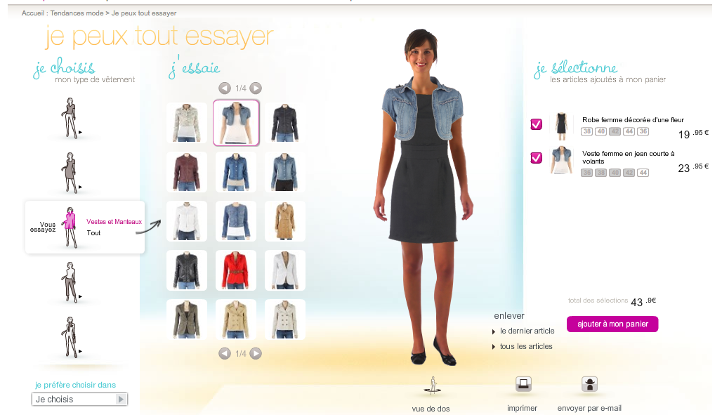
Trying on clothes online: Camaieu
Buying clothes online can sometimes be a hassle: how to know if this rock fits with this shirt? What is the length of this dress, will it fit me? Well, well, the ultimate solution is of course to get to the shop and try them on. But we’re in the 21st century, after all: wouldn’t there be a solution for our online shopping? Summer is the wedding time, and, how they said in this Indian ad on TV, I am not (at all) ready for it. So I started browsing online clothing shops for a dress. And I was happy to find one of these trying-on-clothes application on Camaieu website. The application is very simple, and accessible for every item in the catalog. Quite impressive: you can actually try every combination possible. Even what does not fit together, just for fun.
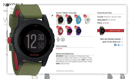
Enlarge images without border
Lightbox is a great tool to enlarge pictures on a web page, and offers multiple possibilities. Recenlty, I have seen this alternative on Nixon watches website: the enlargement of the product is displayed in a div with no border and no background. The result is interesting and the design simple. I don’t know whether or not it is Lightbox, but it looks cool!
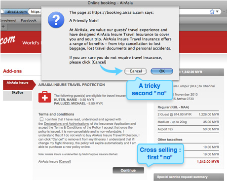
Intrusive cross selling
Cross selling is often the key to a performing e-commerce website. If the user wants to buy a dress, he could be in the mood for buying an accessory or another dress, for a competitive price? And while he’s in the checkout process, it can be a good idea to suggest additional and relevant articles. Cross selling is most of the times suggested in the products pages and in the shopping cart, and sometimes even during the checkout. In this example, the user purchasing a plane ticket has to decline twice the Insurance suggestion: once in a page displayed during the checkout, and once more (after clicking on Cancel) on a pop-up. A little too much, don’t you think?
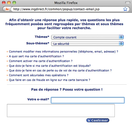
FAQ vs. Contact us: a good example
As a user, it is hard to resist calling the company when you have a specific question. Why bother reading the whole FAQ looking for the answer, when it is so easy to call someone and directly ask for it? For the companies, answering quickly to any request is a must for the conversion, but this can be compromised by the number of requests. So the question is: how to make sure the phone contacts are really not answered by the FAQ, and try to reduce the number of personalized information requests? ING Direct is a very successful online bank, and has managed to find a good balance, in my point of view.
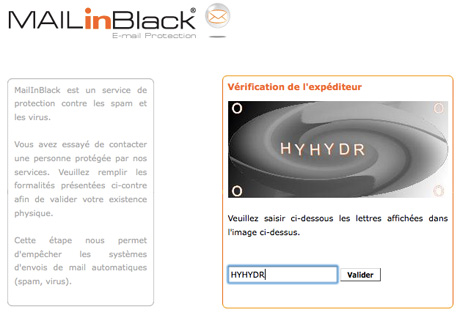
Too dissuasive anti spam (and anti conversion) process
Spams can be a hassle, and I agree sometimes you have to find a way to get rid of them. With current email systems and a few unsubscriptions, it’s become quite easy though, and I, for example, almost never see a spam: they go directly in my junk box. But according to how you use your email address, it can be more difficult. Last week, I tried to contact a company, and was surprised never to get an answer. Today, I finally realized it had been sent. Not only was the answer in my junk box, but it was an automatic reply. And this was not coming from the company itself, but from a website providing anti spam solutions. Basically, I had to click on a link, and then enter a captcha, before my first email was actually sent to the company. I was not a spammer, and could have become a client. Why make it so difficult to contact you? Except if you are overbooked for a few years, I wouldn’t advice going to so restrictive solutions. Let users contact you: this kind of process can definitely make a company loose customers and is of course quite bad for conversion.