Blog
FDLD: tourism industry and Internet
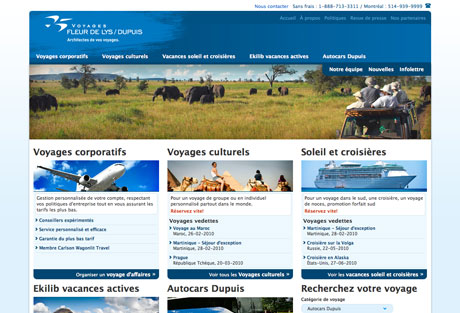
Fleur de Lys Dupuis is a Canadian travel agency based in Montreal, Quebec. Started in 1974 by its current owner, the agency has absorbed other companies, to offer today a complete travel catalog, from coach tours to unique genuine luxury tourism, luxury cruises around paradise islands or bicycling holidays in France. With a single page for 2 of its activities, the company needed a more seductive and efficient presence on Internet. It’s the occasion to talk (a little) about how new technologies changed tourism, through some key-points of the new website.
Workshop: coupdecoeur.qc.ca
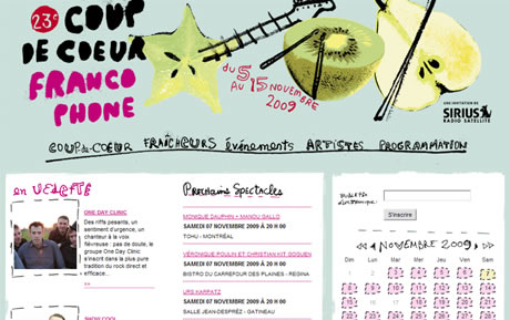
Coup de Coeur Francophone is a music festival which takes place everywhere in Canada. As you could guess, all the concerts are French-speaking, and the festival is impulsed by local French-speaking communities all around the country. Coup de Coeur was created in 1987, and it has expanded its influence ever since, featuring and discovering unique talents. Its current website, coupdecoeur.qc.ca, has been created in 2008, for the event’s 22nd issue. The design was created by orangetango, a very creative communication agency in Montreal, who had also designed the festival’s ad campaigns for a few years. After one whole year of operation, It thought it could be interesting to browse the website for optimization recommendations. I suggest we do this with a SWOT (Strength, Weaknesses, Opportunities, Threats), and see what happens (it’s the first workshop I do on this blog, and it may not be the last…)
Picture keyboard
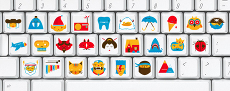
My boyfriend has just forwarded me a link to this beautiful picture keyboard, designed by Christopher Monro Delorenzo. The concept is simple: replace each letter by a picture related to it. So, basically, the pirate character stands for P, etc. The design is really cute, and I found the idea interesting, speaking about usability: who could use it? And speaking about a keyboard, what about the muscle memory?
Should my website be accessible?
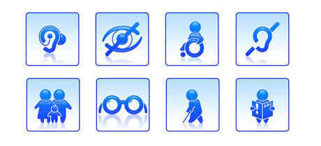
I have been asked a question about accessibility recently, and I realized it has been a long time since I’ve last heard about it. A way too long time. Accessibility means building something -a cinema, a concert hall, a shopping mall, a website, etc.- usable by persons with disabilities. Usability is the beginning of an accessible process: isn’t our job to make sure everyone can use our applications? Though it is just one step further. Isn’t it just normal? Why couldn’t a person with disabilities read a website, when she can enter a cinema, because nobody thought of making it readable for her? In this article, I decided to make accessibility a little more concrete. How? Well, I spent 1 hour browsing the Web with a text-only browser, Lynx. The conclusion of this article introduces to accessibility basic best practices by WAI.
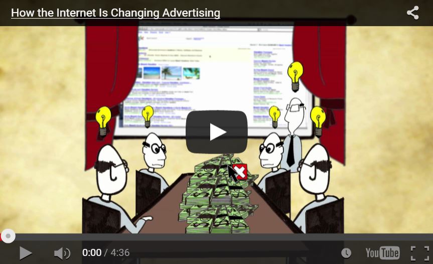
How the Internet changed advertising
A colleague at Adviso has shared this cool video with us last week. It briefly goes through the history of communication, from the invention of alphabet to advertising online, and it explains How the Internet changed advertising. What I particularly likes about this video is that it shows new media (Internet) = new ways of advertising. And I especially like them saying it has to be contextual (this is a strong belief of mine): to visitors needs, interests and interactions. The 2 rules to keep in mind from this video: 1. Trust the power of contextual, 2. To be granted with attention, offer interesting contents.
Multiple OR conditions in Survey Gizmo
During the last days, I have been programming an online survey with Survey Gizmo. It was brand new for me, but I found the solution is very practical and quite intuitive. Though, I got myself blocked at one point, which kept me thinking hard for a few hours: how to implement multiple OR conditions for a page or a question?