Blog
Remote User Research
User Research is a whole process to set up, and I guess some agencies or clients often have rather save some time and money than run user testing. As a Usability consultant, I would love to have that time and money, but I also understand planning and budget restrictions. Hopefully, we can benefit from a bunch of free solutions to help us know users better. I am talking about analytics solutions, like Google Analytics (which as well allows A/B and MVT testing, allowing to go pretty far in user research), but also powerful and specific solutions like Survey Gizmo, for online user testing.
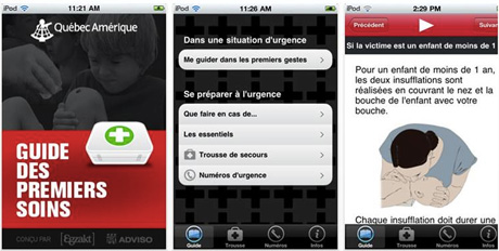
iPhone First Aid app: 900 downloads
Quebec Amerique First Aid application for iPhone was the first mobile application I ever worked on. The application was released on the Apple Store a few months ago, and it is considered a success as it has been downloaded more than 900 times since then. This project was a good occasion to start thinking about mobile Usability and information architecture, and build wireframes, use cases, flowchart and scenario. Not bad, for a start, I’d say!
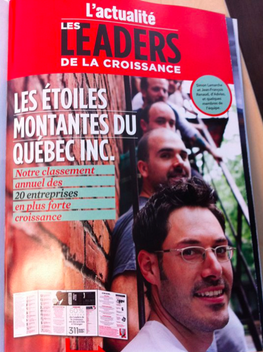
Adviso makes the news
Adviso, a brilliant web strategy company, for which I have worked during the last years, has recently made the news. In the magazine L’Actualité, the company was ranked as one the 20 fastest growing companies in Quebec, Canada. And the magazine Profit Canada ranked them among the fastest growing companies in the country. Well done: congratulations to all the team and all the best! And it is quite clear that their success does not provide them from having good fun (see pictures below).
Improve your work: leave early
A study was recently published in the Psychological Review about efficiency at work. Dr. K. Anders Ericcson studied the way musicians trained, and how long they trained, and compared their focus to their efficiency. The conclusion is that 80% of our outputs come from 20% of our inputs. And that working focused for 4 hours is more efficient than working unfocused for 8 hours. Otherwise said, this study advises us to be more focused for short periods in the day, and allow ourselves to rest: answer less phone calls, check emails less frequently and leave work early. Want to improve your work? Be ready to leave office early!
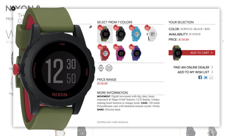
Enlarge images without border
Lightbox is a great tool to enlarge pictures on a web page, and offers multiple possibilities. Recenlty, I have seen this alternative on Nixon watches website: the enlargement of the product is displayed in a div with no border and no background. The result is interesting and the design simple. I don’t know whether or not it is Lightbox, but it looks cool!

Kyo: a new touch-free screen terminal
The 9th World Congress on Railway Research, which took place in Lille this May, was the opportunity to discover a new touch screen terminal. Well, as a matter of fact, Kyo does not involve any touch screen: the user can purchase a train ticket using only his gesture, and without any contact on the terminal. This idea was presented among other innovative processes for selling terminals, but could lead to new navigation methods in the next years. To be followed.