Blog
Intrusive cross selling
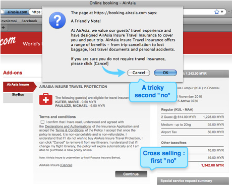
Cross selling is often the key to a performing e-commerce website. If the user wants to buy a dress, he could be in the mood for buying an accessory or another dress, for a competitive price? And while he’s in the checkout process, it can be a good idea to suggest additional and relevant articles. Cross selling is most of the times suggested in the products pages and in the shopping cart, and sometimes even during the checkout. In this example, the user purchasing a plane ticket has to decline twice the Insurance suggestion: once in a page displayed during the checkout, and once more (after clicking on Cancel) on a pop-up. A little too much, don’t you think?
FAQ vs. Contact us: a good example
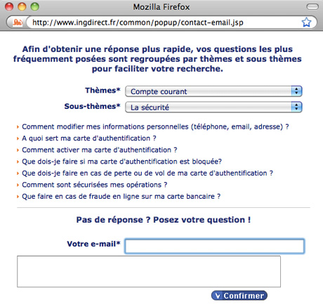
As a user, it is hard to resist calling the company when you have a specific question. Why bother reading the whole FAQ looking for the answer, when it is so easy to call someone and directly ask for it? For the companies, answering quickly to any request is a must for the conversion, but this can be compromised by the number of requests. So the question is: how to make sure the phone contacts are really not answered by the FAQ, and try to reduce the number of personalized information requests? ING Direct is a very successful online bank, and has managed to find a good balance, in my point of view.
Too dissuasive anti spam (and anti conversion) process
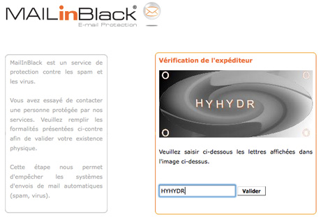
Spams can be a hassle, and I agree sometimes you have to find a way to get rid of them. With current email systems and a few unsubscriptions, it’s become quite easy though, and I, for example, almost never see a spam: they go directly in my junk box. But according to how you use your email address, it can be more difficult. Last week, I tried to contact a company, and was surprised never to get an answer. Today, I finally realized it had been sent. Not only was the answer in my junk box, but it was an automatic reply. And this was not coming from the company itself, but from a website providing anti spam solutions. Basically, I had to click on a link, and then enter a captcha, before my first email was actually sent to the company. I was not a spammer, and could have become a client. Why make it so difficult to contact you? Except if you are overbooked for a few years, I wouldn’t advice going to so restrictive solutions. Let users contact you: this kind of process can definitely make a company loose customers and is of course quite bad for conversion.
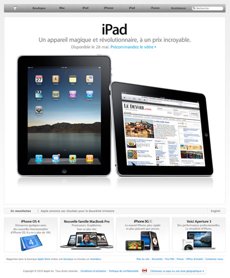
Le Devoir on Apple Homepage
Le Devoir website homepage has been granted a great place on Apple Canada website: it is featured as a page seen through an IPad (it is not a mobile version, but actually the website homepage). A good sign (and the feeling of a victory) for this not-easy to wireframe and 4-columns homepage.
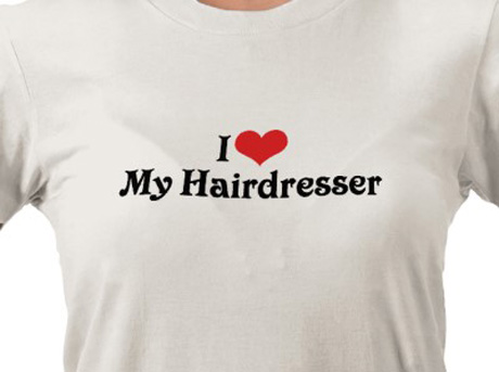
Marketing at the hairdresser’s
Marketing is everywhere in real life, and especially where you don’t expect to find it. For this article, I’d like to transport my readers in the cosy and design atmosphere of a fashion hairdresser. Have you ever felt more beautiful than in a hair design salon? Everybody takes good care of you, making you feel unique, and look brilliant. Why is that? Here are a few thoughts on marketing at the hairdresser’s and best practices we can keep in mind for websites.
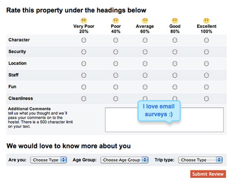
Tourism: email surveys vs. real life survey
Surveys are the perfect tools to measure consumers’ satisfaction. That’s why you merely can’t miss them in shops, in your mailbox, and particularly in hotels. As I have been travelling a lot lately, I have found on my pillow a lot of those. But I have just received my first, and only, one by email. Here are three main reasons why an email survey is more efficient than a printed one.