Luxury e-commerce in 2017: A user experience index
Did you know online sales represented 6% of the global luxury market for personal goods in 2014? Luxury e-commerce [...]
More and more luxury brands are turning to e-commerce and online sales to reach a more and more connected audience and get closer to their customers all over the world. If e-commerce comes with standards and best practices, the luxury industry brings their own values to the concept: top-end personalized service, high quality, design and technology, customer service…
What can e-shoppers expect from luxury brands in terms of user experience and what are the keys to a luxury e-commerce journey in 2018?
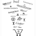
The beginning of the year is the time I conduct a UX benchmark accross luxury websites, to identify best practices in the industry. This year, 32 e-commerce websites were analyzed, and here are the main conclusions.
More and more websites are responsive (81%), and even the ones with a specific mobile version propose the famous burger menu (81%.) Navigation is still mostly focused on brand catalog and communications, but 34% highlight personas (most often men, women, children) directly in the main menu. Some websites still propose a somehow confusing navigation, but there is clearly an effort to make navigation easier, with for example 59% benchmarked brands offering a sticky (always visible) menu.
Home pages vary greatly between websites, and balance between brand communication and e-commerce efficiency. One proof is the huge difference between minimum (1564 pixels) and maximum (15 420 pixels) page length. If all websites display at least one big visual on their home page, only 44% of them propose entry points per persona, 62% display at least one product thumbnail and name, but only 28% include a product price.
Almost all benchmarked websites propose filters on the product lists. Search results are mostly relevant, and it is rather intuitive to find a product, even if we can regret the absence of suggested or personalized products during the search and browsing process. Product pages are not always rich, with only 59% displaying in situation pictures, and 25% not offering specific text storytelling.
Main call-to-action is generally displayed in the first screen, and adds product to basket while displaying a confirmation overlay. 16% benchmarked websites rather open the Shopping cart page instead.
Optimization possibilities were identified on most websites checkout processes
Checkout processes are very different between websites, varying between 4 and 18 required fields (average 10), for a duration between 50 and 166 seconds (average 97s.) 84% websites allow to order as guest, 78% display reassurance over online payment, and 69% give access to information regarding returns and exchanges. If 71% propose a contact link for assistance, only 59% display a phone contact directly visible.
Minor bugs and optimization possibilities were identified on most websites checkout processes, which could probably have an influence on the conversion rate.
Luxury brands are more and more embracing the e-commerce possibilities and best practices in terms of user experience. There is clearly still a hesitation to embrace it fully, and the brand communication and image logically keeps a prominent place in websites content. As in Boutiques, brands pay attention to delivering a top-end service to customers, with extra options, like engraving, gift wrapping, samples, etc. and luxury interestingly redefines e-commerce with its very own values.
This study is conducted annually and allows me to get an overview of where luxury e-commerce is at, and how it is developing and adapting. As a UX consultant, it gives me valuable and actionable insights of customers expectations and brands competition environment, to better advise the companies I accompany. I believe this study can also be of interest to any luxury manager, designer, developer and project manager, and I would be happy to exchange on this topic: don’t hesitate to contact me for user experience advice or just a chat about luxury e-commerce.
Did you know online sales represented 6% of the global luxury market for personal goods in 2014? Luxury e-commerce [...]

A recent study conducted by Google and Ipsos in June 2016 focuses on the usage of Internet for luxury shoppers in [...]
Watchmakers, fashion, beauty, jewelry… luxury brands are at the digital crossroads, with an important decision to [...]