Blog
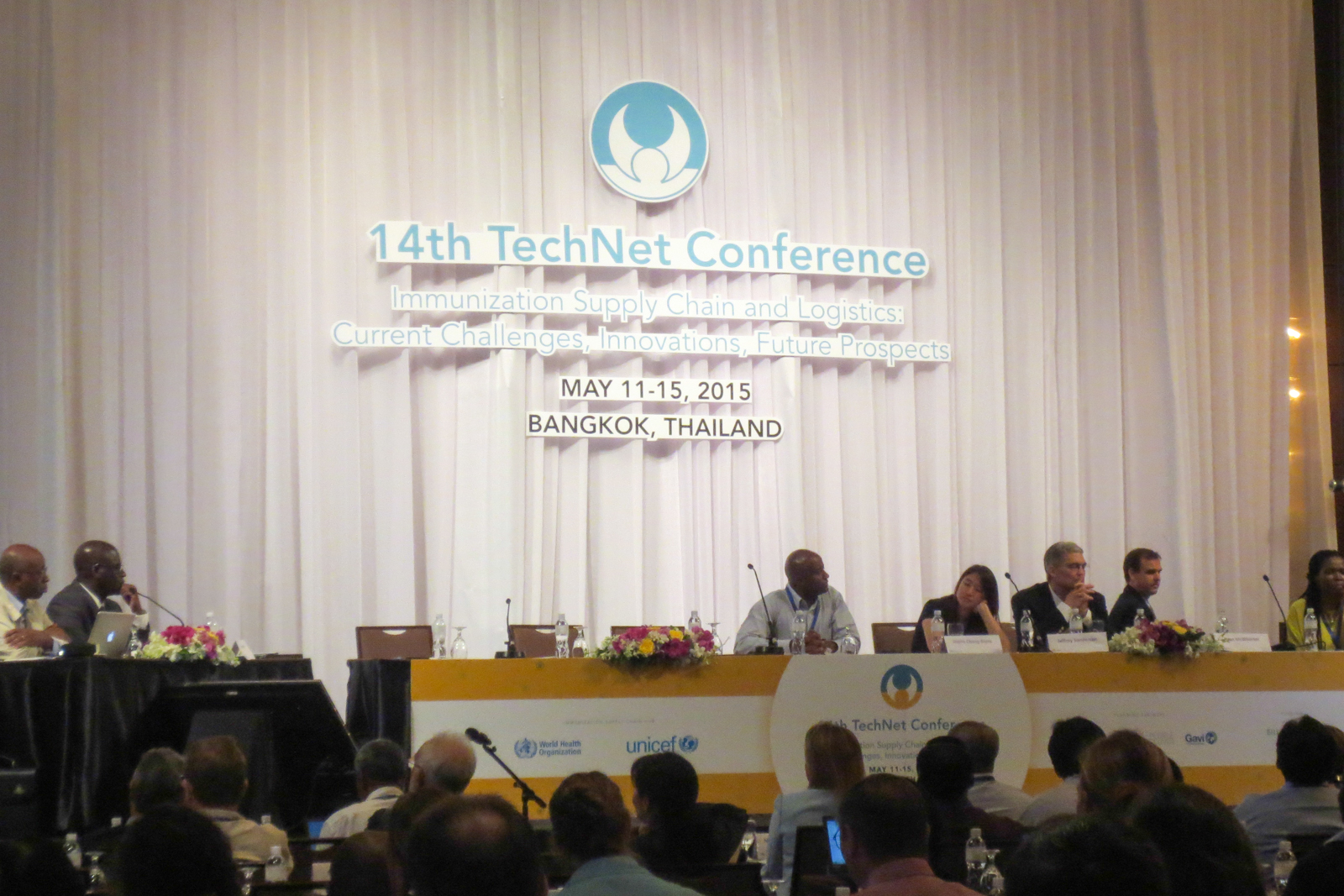
@TechNet-21 Conference in Bangkok
From the 11th to the 15th May, I have the chance of being invited to the WHO and Unicef TechNet-21 conference on immunization. During the 14th edition, held in Bangkok, Thailand, a global network of immunization professionals gather to share experiences, meet and discuss latest developments in immunization practices and policies. I am invited as a UX Consultant to present and test a new digital tool related to public health with present stakeholders and users.

User interview: my template
User interviews and observations are a great way (my favorite) to gather insightful feedbacks. More than subjective opinions of various stakeholders, observing how people use your interface to complete tasks is the best way to get objective, rational and unbiased insights. As Jakob Nielsen said, no need for thousands: 5 users allow you to identify most of UX issues. Same goes with the questions to ask during the interviews. You can’t come up unprepared, as this will lead to inexploitable, uncomparable data. But preparing a long list of questions is counterproductive, as you need to be careful not to lead the answers. As for me, I always use the same template of questions for my interviews. It is based on Avinash Kaushik’s 4 questions.
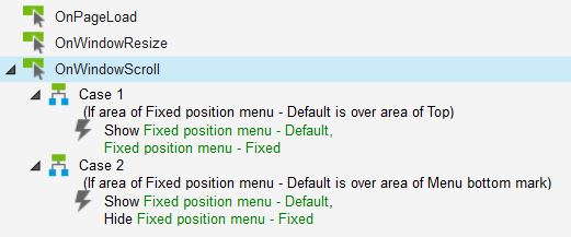
Fixed position menu in Axure
Fixed-position menus are often used on websites or applications today. They allow the menu (or any other toolbar) to remain always visible on top of the screen, no matter how far the users scrolls down. This interaction allows to create higher pages, without worrying about the user getting lost in the sitemap or worrying about finding the navigation again. Axure offers great interaction programming possibilities. And guess what? It is possible to prototype a fixed position menu with Axure, which only sticks to the top when relevant. Here is a ste-by-step tutorial to create a fixed position Axure element, including Axure source and prototype demo on Axshare.
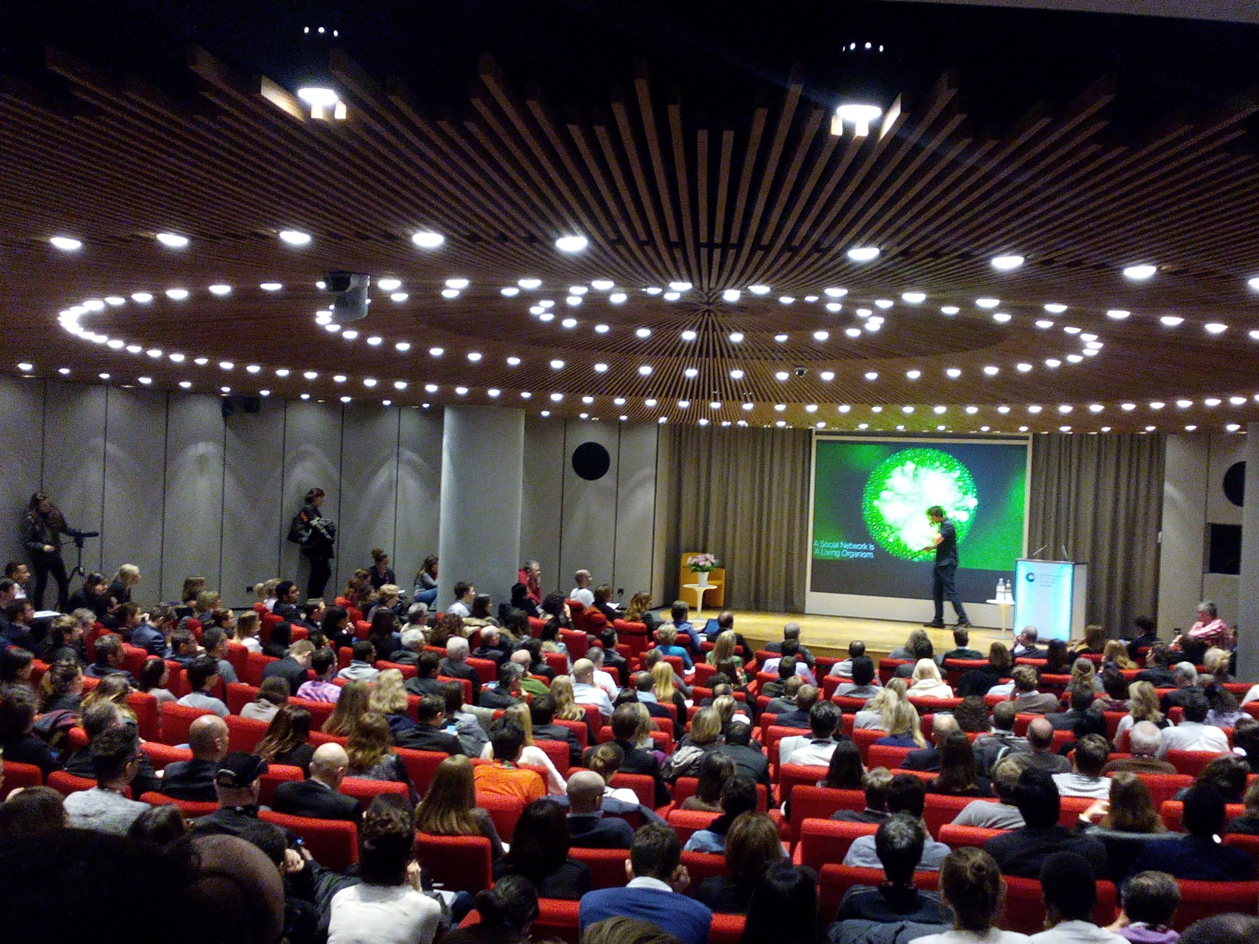
Crea Digital Day
The Crea Digital Day took place yesterday at the Fondation des Entreprises de Suisse Romande in Geneva (Switzerland.) Co-organized and brought to digital professionals for free by Crea school, eMakina and Bilan magazine, this one-day conference featured speakers from Instagram, Tesla, The Audience and Terre des Hommes. If a few speeches turned out having very little to bring to the conversation about digital, or even one or two being plain advertising for a product or a service, we had the chance to attend a few passionating sessions, with charismatic speakers.
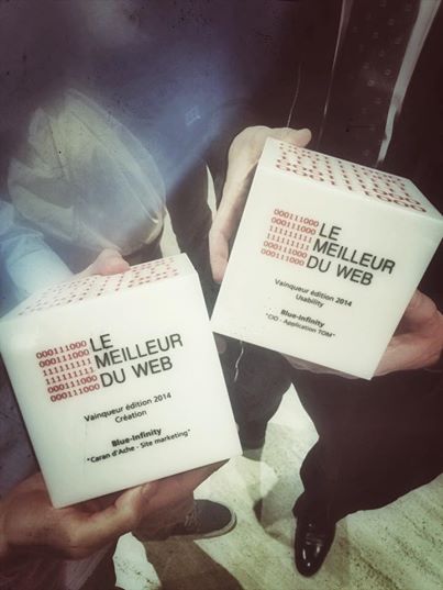
First prize for User Experience at Le Meilleur du Web
A project I have worked on as a UX at blue-infinity was recently awarded first prize for User Experience at Le Meilleur du Web awards in Geneva (Switzerland.) The project was a tablet application for the Olympic Museum in Lausanne. Dedicated to school teachers, it aims at helping them organize and animate the visit for their students. The application was awarded for ease-of-use, intuitive navigation, service design and quality of the final product. Congratulations to the whole team! Since 2011, Le Meilleur du Web highlights digital expertise and encourages excellence in technologies in Swiss Romande. It was founded by Cominmag, ICT Journal, Facebook and Breew, and in partnership with Best of Swiss Web.
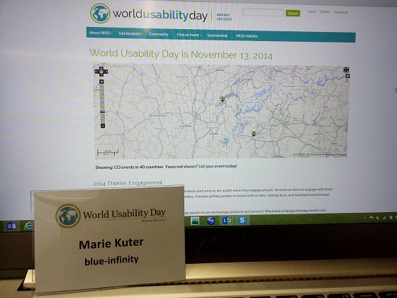
World Usability Day @Geneva
Last Thursday was the World Usability Day: events in 40 countries all over the world happened to promote UX and design thinking. In Geneva, a full-day event was organized by Telono, a well-known local company specialized in UX and user testing. The first part of the day was a training, but I has the chance to be invited to the Afterwork. Nicolas Nova, from Near Future Laboratory, first presented Ethnography and interaction design: how to get to know users to come up with better designs. Then Florian Egger, founder of Telono, presented slides about multi-channel customer experience. Both conferences were very interesting (thank you for that!) and I especially agree with two ideas: