Blog
Check actual screen resolution live – web-based
I usually rely on W3C Schools screen resolution statistics. Though, here and then we do need to have a precise resolution for a specific device. Of course the resolution can be found on the manufacturer’s website. But it takes some time, and it is the theoretical resolution. In the real world, this data is to be modified according to a lot of system’s elements that are added to the screen, and thus occupy some pixels: web browser address and navigation bars, scroll bars, etc. To be sure about the actual design space available on the device, I use Websitedimension.com’s Live Pixel check. The idea is very simple: a grid with a scale, allowing to easily count how many pixels can actually be displayed in height and width.
Drive-to-Shazam TV ad
These days find me particularly sensitive to connected, cross-channels and cross-devices experiences. I have worked quite a lot on that kind of subjects for clients lately: today Brands can’t have a website, mobile applications and websites, ads, etc. independent as before. Same person uses them all, and all touch-points should be part of a unified experience. Even non-digital touch-points.
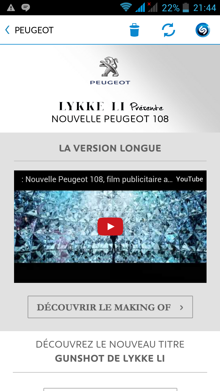
I was recently surprised by a 2-times ad on TV for Peugeot. The first part of the ad is very short. You can hear a music and a feminine voice invites you to open Shazam. For those of you who don’t use it, Shazam is an application that recognizes melodies and helps you find the name and author of a music piece as you hear it. I jumped on my favorite Wiko smartphone right on time before the second part of the ad.
The interesting point of it is that Shazam nearly instantly recognizes the background music, and drives you to a specific page on the app, dedicated to the ad! There, you are invited to discover the song and the product (a car.) I love this idea because it created a direct link between the Brand and me, from an impersonal TV message to my very own mobile phone. I also like that Shazam is a very modern app, that I would not have thought of for this use: I was more receptive and less defiant.
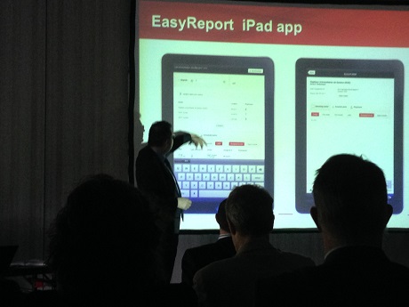
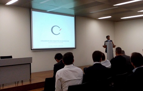
Edwards app featured at Salesforce event in Lausanne
An iPad application I have had the chance to work on was recently featured during blue-infinity / Salesforce event in Lausanne. The conference was about Improving efficiency of Sales, Customer Service and Marketing, and took place at the Starling Hotel yesterday. As a mobile POS iPad application, this application supports sales associates (who are also trainers in this specific context) follow-up their portfolio, plan and report activities. I have worked quite a bit on this kind of applications lately, helping companies have a better and more reactive knowledge of their customers and offering them a better experience.
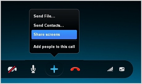
Conducting international User Observations with Skype
User observations are often key within the User Research phase. A privileged moment between the UX consultant and the system’s users, it gives a valuable insight on how users really use the system in a real-life context. On top of being an excellent base for building personas, scenarios and use cases, it is also a chance for the company to show that they care about users, and to build a relationship based on trust, which should later facilitate change acceptation.
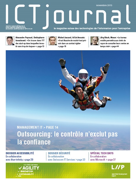
Publication in ICT Magazine: Accessibility
As a Senior UX Consultant at blue-infinity, I had the chance to be published in ICT Magazine (November 2013 issue) with my contribution to a dossier about Web Accessibility. The dossier gave the context of accessibility (history, legal) and aimed to give wider opportunities with most recent trends and evolutions (like responsive web design for example.) I was in charge of the background article, on the legal and history context in France and Switzerland.
Mobile Swiss Expo Geneva: Clio on iPad apps for companies
Last week, I had the chance to be invited to the Mobile Swiss Expo at Palexpo Geneva. Among other conferences gathering local IT companies, I listened to Clio (a Geneva-based company developing softwares and applications)’s Head of Mobile Solutions, Yohann Pelé, present their learnings about iPad applications for companies. A presentation of their products, cDocs and cForm, was a good opportunity to learn more about clients’ needs, expectations and history with mobile business solutions. The conference was mostly about document sharing and interactive processes, which I have also found a recurrent request from clients.